The new logo
A descriptive emblem
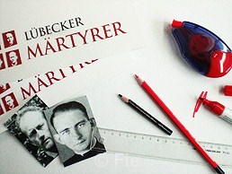
The beatification in 2011 was the motivation to support the remembrance by a descriptive logo. It shall be used in religious services, on posters and flyers and on all other occations in public where people commemorate the four clergymen. The logo shows the lettering “Lübeck Martyrs” in the German language as well as the four portraits, arranged in the form of a cross.
The lettering in stark capital letters dominates. In two words it states what connects the four: The conjoint activities in the same city and the death for Jesus Christ. All our are the Lübeck Martyrs, they died for their faith. The colours red and black remind us of their martyrdom, of blood and grief.
All faces are turned towards the viewer. “Extinguish my eyes, I can see you.” Prassek underlined this quotation from Rilke's Book-of-Hours during his time in prison. The four now can see God face to face. The four heads form a unit. In the ecumenical approach, in the concerted commitment they witnessed Christ and his Church in a dark era like “bright shining lights” (Peter Gerloff). From the red background, the heads are shining white as a sign of hope and life.
Together, the framed portraits form a negative cross. The clergymen lived in an era in which the denominations strongly dissociated from each other. Their alliance was different, that is what the image wants to express. Not things which separated, but things which bound them in the cross. More than that, the cross is not apparent without them. Discipleship becomes vivid where people unite to follow God's ways together.
The shape of this cross ist awry, angled, awkward. You feel the need to put it all back in a straight lines. The angle of the cross reminds one that not all in the course of a day is straight and smooth, that discord and awkwardness in life and faith can be a cross for you. But just in the cross we manifest our solidarity.
Sebastian Fiebig


